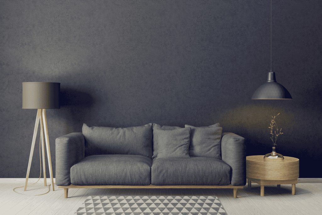
If you’re looking for a bold yet versatile paint, Peppercorn Sherwin-Williams (SW 7674) is a top contender. This deep charcoal gray creates drama without overwhelming your space. It blends elegance with flexibility, making it a designer favorite.
In this guide, I’ll cover everything you need to know. You’ll learn about its undertones, lighting effects, best pairings, and where to use it. By the end, you’ll see why Peppercorn stands out among dark grays.
What Makes Peppercorn Unique
Peppercorn is more than a simple gray. It sits perfectly between charcoal and soft black, balancing depth with subtlety. That balance is why it feels bold but approachable.
I often recommend Peppercorn to clients who want something dramatic without going all the way to black. Black can feel too harsh. Lighter grays can look washed out. Peppercorn finds the middle ground and adapts well in many homes.
Understanding the LRV
Every paint color has a Light Reflectance Value (LRV). It shows how much light the shade reflects. On the scale, Peppercorn is a 10.
This means it absorbs most of the light in a room. The result is a moody, rich look. But in small or dark spaces, it can feel heavy. That’s why I always consider the natural light in a room before using it.
Bright rooms with large windows can handle full walls in Peppercorn. Dim rooms often need it as an accent instead.
Undertones You Should Know
Peppercorn looks neutral at first, but undertones appear in different lighting. In north-facing rooms, it leans cooler and shows blue hints.
In southern light, it can warm slightly and reveal purple undertones. At night, bulbs make a difference. LEDs push it cooler. Incandescent bulbs soften it with warmth.
Because undertones shift so much, I suggest testing samples throughout the day. Watch it in morning, afternoon, and evening light. You’ll see how flexible it is.
If you’d like a softer option with airy blue-gray tones, check out our Sherwin-Williams Upward review.
How Lighting Shapes Peppercorn
Lighting is the single biggest factor in how Peppercorn looks. In bright natural light, it feels deep but sophisticated.
In shadowy corners, it can look flat or overly dark. Artificial lighting adds another layer. Warm bulbs create softness. Cooler bulbs highlight its gray base.
That’s why I always tell clients: test before you commit. Move a sample board around the room. Watch how it changes with the sun and lamps. It will save you from surprises later.
Pairing Colors with Peppercorn
Peppercorn works well with both bold shades and neutral tones. Pairing it with jewel greens, deep blues, or burgundy creates drama. I used this combo in a living room, and it felt upscale instantly.
For a timeless look, contrast Peppercorn with crisp whites. Sherwin-Williams Pure White is a favorite. Kitchens often look stunning with Peppercorn islands and white cabinets. The contrast feels sharp but balanced.
It also pairs nicely with warm neutrals. Accessible Beige, light browns, or soft taupes keep rooms cozy. This pairing works especially well in living rooms and bedrooms with wood flooring.
A great example is Swiss Coffee Sherwin-Williams, a warm off-white that balances Peppercorn beautifully
Comparing Peppercorn to Other Dark Shades
Clients often ask me how Peppercorn compares to other dark Sherwin-Williams paints. Let’s break down the three most common comparisons.
First, Iron Ore (SW 7069). Iron Ore is darker and warmer. It feels more intense. Peppercorn is softer and more versatile, so I recommend it in mixed-style homes.
Next, Urbane Bronze (SW 7048). Urbane Bronze carries clear brown undertones, giving it an earthy feel. Peppercorn stays neutral and works better with cool and warm palettes.
Finally, Grizzle Gray (SW 7068). This shade is lighter and more approachable. It’s a good alternative if Peppercorn feels too bold. I often recommend Grizzle Gray in traditional spaces and Peppercorn in modern homes.
Where to Use Peppercorn
Peppercorn’s versatility makes it useful in almost any room. The key is balance. Use it thoughtfully, and it adds elegance without heaviness.
For feature walls, Peppercorn makes a strong focal point. Pair with lighter furniture and metallic decor to avoid a dark cave feel.
In kitchens, it shines on cabinets and islands. I like pairing it with white countertops and brass hardware. Wood shelving or butcher block tops add warmth and texture.
For dining rooms, Peppercorn creates intimacy. It highlights wood tables beautifully, whether light oak or dark walnut. Strong overhead lighting keeps the room inviting.
On exteriors, Peppercorn works for siding, doors, or shutters. It looks sharp against white trim and natural stone. Always test samples outside, though. Sunlight can make it look lighter than you expect.
Tips for Using Peppercorn Effectively
I’ve learned that Peppercorn works best when paired with texture. Adding linen fabrics, natural wood, or metallic accents prevents it from feeling flat.
Balance is also critical. If you go bold on walls, keep rugs, trim, and furniture lighter. When you limit the number of dark surfaces, Peppercorn feels more intentional and striking.
Finally, don’t overdo it. In many cases, a single accent wall or a set of cabinets creates more impact than an entire room painted in Peppercorn.
Real Examples from Projects
One client wanted a bold living room feature wall. We painted it Peppercorn and kept the rest Pure White. The result was modern, bright, and dramatic.
In another project, I used Peppercorn for lower kitchen cabinets and a large island. We paired it with white uppers and chrome hardware. It created contrast without feeling cold.
For exteriors, I recently helped a homeowner choose Peppercorn for their siding. With white trim and a natural wood door, it boosted curb appeal instantly. The color looked rich in sunlight but never too harsh.
Conclusion
Sherwin Williams Peppercorn is far more than just another gray. It’s bold yet balanced, dramatic yet versatile. With the right light and pairings, it can elevate any room or exterior.
If you’re considering it, always test large swatches. Look at it throughout the day and under different bulbs. Pair it with lighter tones or rich accents for balance. Done right, Peppercorn will give your home timeless sophistication.
Frequently Asked Questions
Is Peppercorn warm or cool?
It’s neutral. Depending on light, it can lean cooler or warmer.
What color is lighter than Peppercorn?
Grizzle Gray is one shade lighter on the same strip.
Does Peppercorn work outside?
Yes. It’s a strong choice for front doors, shutters, or siding.
What trim color works best with it?
Pure White offers a sharp contrast, while creamier whites create a softer look.