Many homeowners search for the perfect neutral paint color that works in any room. Benjamin Moore’s Wind’s Breath (OC-24) has become a top choice for people who want something between pure white and beige. This shade offers a balanced look that fits with many different design styles.
Wind’s Breath works well because of its special mix of undertones and how it responds to different types of light. The color can make rooms feel calm and welcoming without being too bold or plain. Understanding how this paint color works in different spaces helps homeowners make smart choices for their decorating projects.
Key Takeaways
- Wind’s Breath is a versatile neutral paint that balances between white and beige tones
- The color’s unique undertones help it work well in various lighting conditions and room styles
- This shade creates a calm, welcoming atmosphere that complements many flooring and decor choices
About Benjamin Moore’s Wind’s Breath (OC-24)
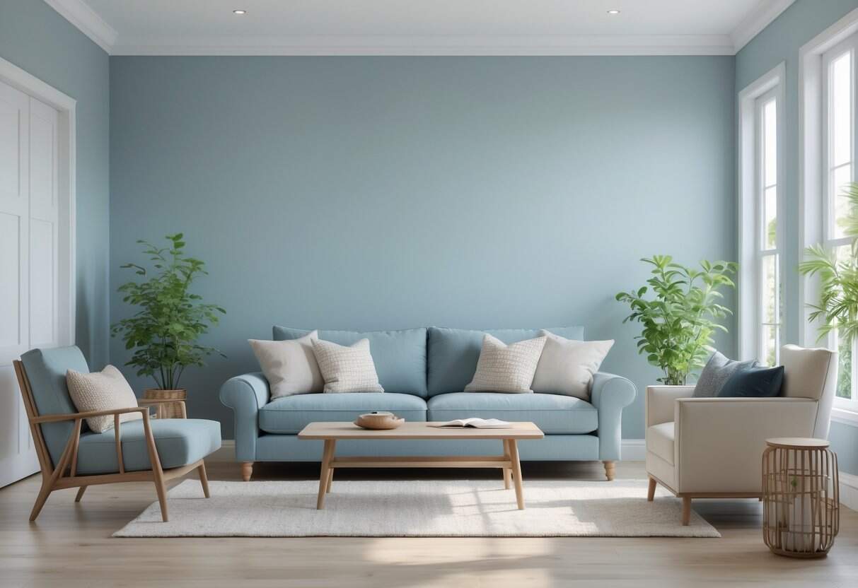
Wind’s Breath stands out as a popular paint choice from Benjamin Moore. This soft, greige color carries warm undertones that make spaces feel welcoming.
If you want to see how a similarly deep Benjamin Moore hue performs in design and light, take a look at my Benjamin Moore Wrought Iron Guide.
The paint has an LRV of 69.59, indicating that it reflects a substantial amount of light. This makes rooms feel bright without being too stark or cold.
Key Features:
- Brand: Benjamin Moore
- Color Code: OC-24
- Base Color: Soft greige with warm hints
- Light Reflectance: 69.59 LRV
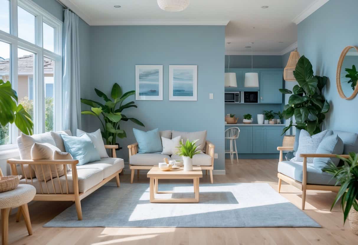
Wind’s Breath works well in many rooms throughout the home. Living rooms benefit from its calming nature. Bathrooms feel spa-like with this shade. Kitchen cabinets painted in this color create a timeless look.
This paint pairs beautifully with different materials and colors. Warm wood tones complement its greige base. Soft whites create clean contrasts. Muted blues and greens add peaceful accents.
The color adapts to various design styles. Modern homes gain warmth from its subtle tones. Traditional spaces feel updated but not trendy. Rustic and transitional styles both embrace its versatility.
The Deep Undertones that Make Wind’s Breath Stand Out
Wind’s Breath contains subtle greige undertones with gentle warm notes. These qualities set it apart from standard neutral paints.
Light Performance:
- LRV: 69.59
- Reflects good amounts of light
- Maintains visual depth
The color transforms as lighting changes throughout the day. Morning sun brings out warmer beige characteristics. Gray tones emerge more clearly in afternoon light. Evening lamp light creates a golden, cozy feeling.
For another versatile neutral that often pairs beautifully with soft greige tones, explore The Ultimate Color Guide for 2025
This shifting quality adds visual interest to rooms. The paint adapts naturally to different surroundings without needing careful temperature matching.
Works Well With:
- Wood furniture (oak tables, natural dressers)
- Soft textiles (linen curtains, cream rugs, ivory bedding)
- Metal accents (matte brass fixtures)
The versatility makes it popular for whole-home use. Homeowners can paint multiple rooms without worrying about clashing undertones. The color brings calm unity to spaces while adding subtle dimension.
Wind’s Breath doesn’t compete with other design elements. Instead, it supports and enhances existing furniture and decor. This supportive quality makes decorating easier and more flexible.
How Wind’s Breath Transforms Room Atmosphere
1. Gentle, Airy, and Inviting
Wind’s Breath makes rooms feel larger and more comfortable. The color smooths out sharp edges and creates a peaceful feeling.
Small spaces benefit the most from this paint choice. The soft tone prevents walls from closing in while avoiding the cold feel of pure white.
A lighter complementary shade that works beautifully with transitional neutrals like this is the Sherwin-Williams Upward.
2. Ambiance and Light Pairing
This paint color brings balance to any space. It stays away from cold gray tones and heavy beige shades.
Lighting options work differently:
| Light Type | Effect |
|---|---|
| Warm yellow bulbs | Brings out cozy feelings |
| White LED lights | Creates clean, modern look |
The color responds well to both warm and cool lighting setups.
3. Matches Various Furnishings
Wind’s Breath works with many furniture styles and materials. Light wood floors blend nicely with this wall color. Dark wood cabinets also pair well.
The paint complements:
- Wood finishes
- Fabric furniture
- Metal fixtures
Rooms look complete without needing bright decorations. The wall color provides enough visual interest on its own.
Works With Any Design Style
This paint color adapts to different home styles without looking out of place. It brings balance to spaces while letting other design elements shine.
Blends Well With Any Color Scheme
Strong colors like deep blues and emerald greens create nice contrast against this neutral base. Lighter shades such as blush pink and ivory work together for a gentle, peaceful feel.
The color stays in the background instead of competing with furniture or decorations. This makes it simple to change accent pieces without repainting walls.
Use Throughout Your Home
Popular areas for this color:
- Hallways that connect different rooms
- Ceiling treatments for subtle depth
- Trim work around windows and doors
- Kitchen or bathroom cabinets
The color creates smooth flow between spaces when used in connecting areas.
Stays Current Over Time
Natural light changes throughout the day and seasons affect how this color appears. It looks good in bright morning sun and warm evening light.
Many neutral colors become boring after a few years. This shade keeps visual interest without following short-term design trends that quickly go out of style.
Best Places to Apply Wind’s Breath Throughout Your House
1. Main Living Areas
Wind’s Breath transforms main living spaces into calm retreats. The soft gray undertones create warmth without overwhelming the room.
This shade works with different furniture styles. Leather sofas and fabric chairs both look great against these walls.
The neutral backdrop lets homeowners highlight their personal style. Colorful artwork pops against the gentle tone. Seasonal decorations stand out beautifully.
Open floor plans benefit from this color choice. It defines spaces while maintaining smooth transitions between rooms.
2. Powder Rooms and Full Baths
Small powder rooms appear larger with this light paint choice. The off-white base reflects light better than darker colors.
Key benefits for bathrooms:
- Makes tight spaces feel open
- Hides water marks easily
- Pairs well with white fixtures
- Adds warmth to cold tile
Larger bathrooms gain a cozy feeling. The subtle gray keeps the space from feeling sterile like pure white can.
3. Cabinetry in Cooking Spaces
Kitchen cabinets get new life with this fresh alternative to stark white. The color adds character without dominating the space.
Popular cabinet combinations:
| Lower Cabinets | Upper Cabinets | Style Result |
|---|---|---|
| Wind’s Breath | White | Modern layered look |
| Wind’s Breath | Wood tone | Warm traditional feel |
This approach creates visual interest while staying timeless.
4. Transition Spaces and Corridors
Hallways painted in Wind’s Breath connect rooms smoothly. The consistent color makes homes feel larger and more planned.
Long corridors become less tunnel-like with this soft shade. It reflects available light and makes narrow spaces feel wider.
Using the same color in connecting areas creates flow. Homes feel unified when transition spaces work together.
Flooring Options That Complement Wind’s Breath
Pale Wood Flooring – Clean & Nordic
Pale oak, maple, or birch floors bring out Wind’s Breath’s light qualities. The warm tones in these materials work together to create a calm, flowing look.
This combination works well for Nordic, coastal, or simple home styles. The light wood adds warmth without making the space feel heavy.
Bleached Wood Surfaces – Casual & Beachy
Bleached or weathered wood floors highlight the gray notes in Wind’s Breath. This match creates a relaxed, ocean-like feel that works great in beach homes, cottage spaces, or modern casual rooms.
The pairing adds light to the room without sharp differences in color.
Earth-Tone Tile Floors – Natural & Balanced
Beige, tan, or cream tiles work smoothly with Wind’s Breath’s warm side. This mix suits mixed-style or Mediterranean homes, especially in kitchens or bathrooms.
Natural stone options like limestone or travertine add texture while keeping the calm feel.
| Tile Type | Best Rooms | Style Match |
|---|---|---|
| Limestone | Bathrooms, Kitchens | Mediterranean, Natural |
| Travertine | Entryways, Living Areas | Transitional, Warm |
| Cream Ceramic | Any Room | Modern, Clean |
Rich Dark Wood – Refined & Elegant
Deep walnut or mahogany floors make a strong contrast with Wind’s Breath walls. This creates an elegant but balanced look that fits classic, formal, or older home styles.
The dark floors add visual weight while the light walls keep the space feeling open. This works well in dining rooms or studies.
Area Rug Choices – Textured & Warm
Neutral rugs in cream, tan, or soft gray add warmth and texture to Wind’s Breath rooms. For more style, pick rugs with quiet blue or green patterns.
This approach works for bohemian, classic, or mixed design styles. Keep colors soft to maintain the peaceful mood.
Key rug tips:
- Choose soft neutral colors for a smooth look
- Add quiet patterns in blue, green, or dusty pink
- Skip bright colors that fight with Wind’s Breath’s softness
- Use textured weaves for visual depth
- Pick larger rugs for open spaces and smaller ones for halls
The right rug ties Wind’s Breath walls and floors together. Texture matters as much as color when creating a complete look.
Wind’s Breath vs. Other Benjamin Moore Colors
Wind’s Breath offers a balanced approach that sets it apart from other popular Benjamin Moore neutrals. Each color brings different strengths to various spaces.
Classic Gray (OC-23) leans cooler with purple hints. This makes it ideal for south-facing rooms that receive strong sunlight. Wind’s Breath provides more warmth and flexibility across different lighting conditions.
Pale Oak (OC-20) carries beige tones with pink undertones. While this creates a cozy feel, the pink can clash with certain wood finishes. Wind’s Breath avoids this issue with its more neutral base.
| Color | Light Level Needed | Best Room Type | Undertone Issues |
|---|---|---|---|
| Wind’s Breath | Any | Flexible – any room | None |
| Edgecomb Gray | High light | Large spaces | May clash without green accents |
| Balboa Mist | Medium to high | Modern spaces | Too cool for north rooms |
| White Dove | Any | Traditional spaces | Can feel stark |
Edgecomb Gray (HC-173) works well in plant-filled rooms due to its green undertones. However, it needs more light to prevent looking muddy. Wind’s Breath performs better in lower light situations.
White Dove (OC-17) stays much lighter with creamy yellow hints. This creates a different effect entirely – closer to white than the gentle color depth Wind’s Breath provides.
Balboa Mist (OC-27) brings violet undertones that suit modern, cool-toned furniture. North-facing rooms can make this color feel cold, while Wind’s Breath maintains warmth in these challenging spaces.
Wind’s Breath avoids the common pitfalls of other neutrals by staying truly balanced between warm and cool territories.
Final Thoughts
Wind’s Breath proves itself as a dependable neutral choice for most living spaces. This paint color offers the right mix of warm and cool tones that adapt well to different rooms.
Testing is essential before making a final decision. Homeowners should apply samples to various walls and watch how the color changes from morning sunlight to evening artificial light.
The color has shown consistent results across many different homes. It creates a classic appearance that doesn’t go out of style quickly. However, personal preference matters most when choosing paint colors.
Key benefits of this neutral include:
- Works in multiple room types
- Balances warm and cool undertones
- Maintains appeal over time
- Adapts to different lighting conditions
The smart approach involves starting with a sample to see real results. This allows people to make informed choices about their paint selection.
For those planning whole-home color schemes, pairing options exist with other quality paint colors. Benjamin Moore offers additional shades that complement this neutral well.
Professional experience shows that neutral colors like this one deliver reliable results. They provide a solid foundation for decorating and furniture choices.
The decision ultimately rests with the homeowner. Trust personal reactions to the color after proper testing. If the shade feels right in the space, that indicates a good match.
Starting with samples remains the best first step for anyone considering this paint color. This approach leads to better outcomes and more confident color decisions.