Choosing the right paint color can change the entire mood of a space. A deep gray-black shade like Benjamin Moore’s Wrought Iron offers a balance of boldness and subtlety that works in many settings. It can bring depth to a room without feeling too harsh, making it a versatile option for different styles.
You can use this color to highlight certain areas, create contrast, or add a modern touch. Its undertones shift slightly depending on the lighting, which means it can look different throughout the day. With the right placement and pairings, it can give your home a polished and timeless look.
Key Takeaways
- This color adds depth and character to a space
- Lighting and placement affect how it looks
- It works well with many design styles and areas of the home
The Rich Depths That Set Wrought Iron Apart

Wrought Iron is not flat black. Instead, it carries subtle tones that make it more complex and versatile. You notice hints of charcoal, navy, and a soft black working together, which gives the color more personality than a standard dark paint.
One key detail is its Light Reflectance Value (LRV) of 8.17. This low number means the color absorbs most light, yet it still reveals depth instead of appearing flat. Because of this, the shade adapts to its surroundings and feels different depending on the light source.
- Bright daylight: Navy undertones become more visible.
- Low light: Charcoal qualities take the lead.
- Shifting hours: The color moves between these tones, creating a layered effect.
You can see the difference for yourself by testing a sample. Paint a small board, then move it around your space during the day. Morning light may bring out softer notes, while evening light deepens the tone.
This shifting quality gives each room a distinct look. In one space, the color may feel bold and cool, while in another it feels warm and grounded. The depth within Wrought Iron allows walls to show texture and variation without needing extra finishes.
| Lighting Condition | Undertone Seen Most |
|---|---|
| Bright daylight | Navy hints |
| Dim light | Charcoal tones |
| Mixed lighting | Balanced depth |
How Wrought Iron Shapes the Atmosphere of a Room
When you use Wrought Iron on your walls, it immediately sets a calm and mature mood. The deep shade makes objects in the room stand out more clearly. For example, lighter furniture, metallic accents, or natural wood finishes appear sharper against the darker backdrop.
In smaller areas, this color can create a sense of closeness. A small bathroom or hallway painted in Wrought Iron often feels more private and inviting. Instead of looking plain, the space takes on a cozy and contained quality.
In larger rooms, the effect changes. Dark tones like this can soften the edges of walls, making them feel less rigid. This can give the space a more open and blended look, rather than shrinking it.
Lighting plays a key role in how you experience the color.
- Morning light: brings out faint blue undertones.
- Evening light: adds warmth, making it feel closer to charcoal.
| Time of Day | Color Effect |
|---|---|
| Morning | Cool, with blue hints |
| Evening | Warm, softer charcoal |
This shifting quality makes Wrought Iron versatile, adapting to different times of day while keeping a steady, grounded feel.
Why Wrought Iron Works Well in Any Room
Wrought Iron gives you a color that adapts to many styles without feeling out of place. You can use it in a modern setting with clean lines, or in a traditional room with rustic details. Its balanced tone makes it easy to pair with different furniture and finishes.
You can apply it in small or large ways, depending on your space. A single accent wall can draw attention and create a clear focal point. Covering every wall in a room builds a more enclosed and focused atmosphere, which works well in spaces like offices or reading areas.
The strength of this color comes from its layered mix of shades. It carries hints of navy and charcoal, which help it blend with a wide range of surfaces and textures. This subtle depth makes it feel versatile rather than flat.
Materials that pair well with Wrought Iron include:
- Warm wood tones
- Cool stone finishes
- Metal accents like brass
- Light fabrics in white or cream
| Use Style | Effect Created |
|---|---|
| Accent wall | Clear focal point |
| Full room | Enclosed, focused atmosphere |
| Mixed materials | Balanced, cohesive appearance |
Because it works as both a backdrop and a feature, you can rely on it through different design changes without needing to repaint.
For a lighter counterbalance, Sherwin Williams Upward works beautifully alongside Wrought Iron, creating a striking yet harmonious look.
Best Places to Feature Wrought Iron in Your Home

1. Accent Walls in the Bedroom
Using Wrought Iron on bedroom walls creates a calm and restful setting. The deep shade reduces distractions and helps you unwind at night. In daylight, the subtle blue undertone softens the room and keeps it from feeling flat.
If you prefer a lighter touch, paint only the wall behind your bed. This adds depth without overwhelming the entire space. Pair it with neutral bedding or wood furniture for balance.
Quick tips:
- Start with one wall before committing to all four.
- Mix with light bedding for contrast.
- Add warm lamps to soften the darker tone.
2. Dark Cabinet Finishes in the Kitchen
Cabinets take up much of the kitchen’s visual space, making them a smart spot for this color. Painting lower cabinets in Wrought Iron while keeping upper cabinets light creates a balanced look. The darker base anchors the room and makes the ceiling feel higher.
Your counters will also stand out more against the deep tone. Whether you have marble, quartz, or butcher block, the contrast highlights the surface.
| Cabinet Style | Works Well With |
|---|---|
| Shaker | Marble tops |
| Flat panel | Butcher block |
| Glass front | Quartz |
3. Painted Vanities in the Bathroom
A vanity painted in Wrought Iron can look custom without the cost of new furniture. The color gives a plain cabinet more character and works with many hardware finishes. Chrome, brass, or matte black all pair well with the shade.
This update also helps highlight mirrors, sinks, and lighting. A small project like this can make the whole bathroom feel refreshed.
How Wrought Iron Compares with Other Benjamin Moore Shades
When you look at Wrought Iron, you see a dark tone that sits between navy and charcoal. Its light reflectance value (LRV) is lower than mid-tone grays but higher than a true black, which makes it a softer option. You can use it in almost any room because it adapts well to both warm and cool palettes.
Other Benjamin Moore colors have more defined undertones. Kendall Charcoal leans toward a green-gray, which can feel cozy but may not suit every space. Cheating Heart carries brown hints, giving it a warmer look that works better with wood finishes. Black Beauty is the darkest choice, with very little undertone, making it best for modern or high-contrast designs.
A quick comparison helps show the differences:
| Color | Undertones | Best Use Case | Why Pick It Over Wrought Iron |
|---|---|---|---|
| Wrought Iron | Navy, charcoal | Flexible for most rooms | When you want depth with softness |
| Kendall Charcoal | Green-gray | Bedrooms, studies | When you prefer less blue and lighter |
| Cheating Heart | Brown charcoal | Traditional, wood-heavy rooms | When you want warmth without blue |
| Black Beauty | True black | Modern, high-contrast spaces | When you want pure black |
If you’re exploring similar moody tones, Sherwin-Williams Peppercorn offers another versatile option with a slightly different undertone profile.
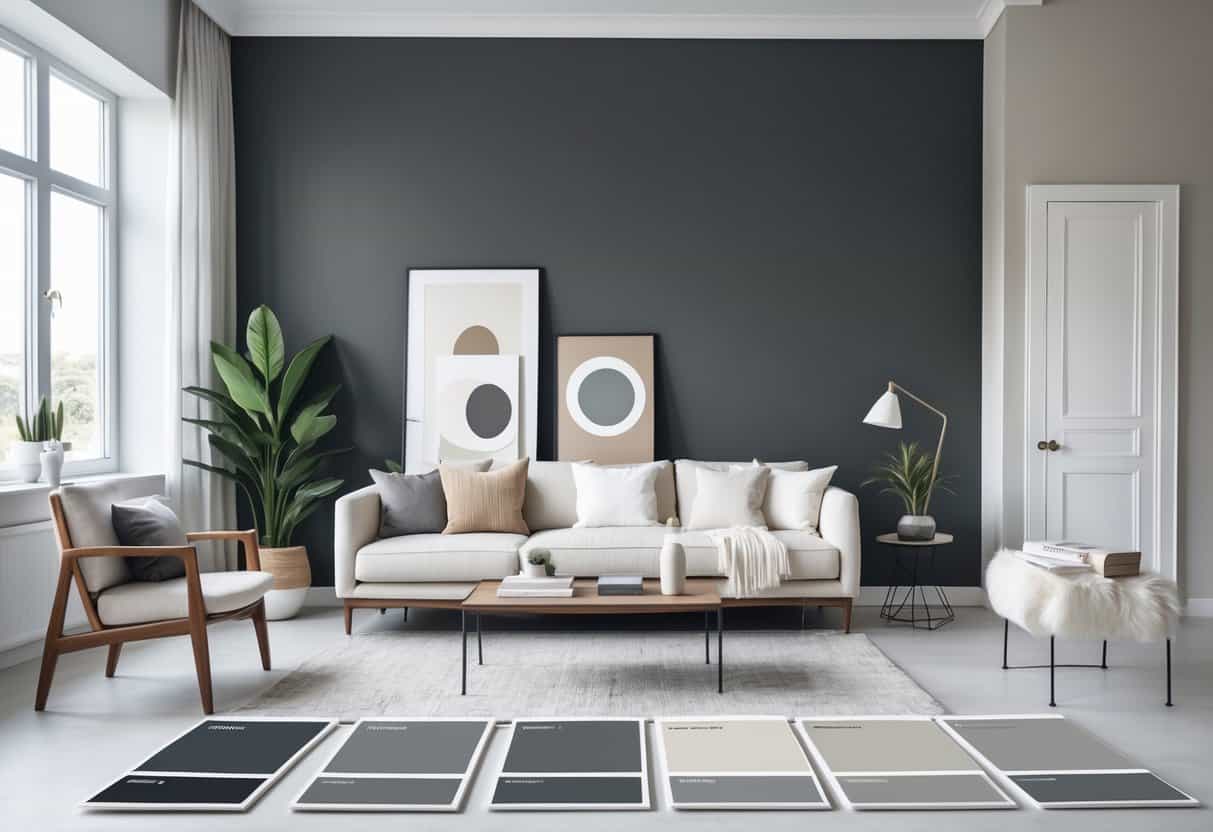
Test large swatches in different spots of your room. Lighting and nearby colors can shift how each shade looks, especially with darker tones.
Conclusion
When you choose a paint color, you want something that works in different settings and holds up over time. A shade like Wrought Iron gives you depth without feeling too heavy, which makes it practical for many rooms. You can use it in small doses or cover a full space, and it still feels balanced.
Light plays a big role in how this color looks. During the day, you may notice subtle changes that keep the room interesting. At night, it settles into a rich tone that feels calm and steady. This flexibility means you don’t have to worry about it looking flat or dull.
Before you commit, test the color in your own space. Paint a section of wall or use a sample board, then watch how it shifts in different light. Taking this step helps you avoid mistakes and gives you confidence in your decision.
Key points to keep in mind:
- Works well in both modern and traditional spaces
- Adjusts with natural and artificial light
- Strong enough for a feature wall, subtle enough for full coverage
- Testing first helps you see how it fits your home
You may also want to compare it with other shades that share similar qualities. Some colors lean warmer, others cooler, and noticing these differences can guide you to the right fit. Creating a small chart can help:
| Feature | Wrought Iron | Other Dark Shades |
|---|---|---|
| Depth | Medium-Deep | Varies |
| Flexibility | High | Moderate |
| Works in Many Styles | Yes | Sometimes |
| Light Sensitivity | Noticeable | Less noticeable |
By paying attention to these details and testing carefully, you can feel sure about your choice and enjoy a color that adapts to your space with ease.
Frequently Asked Questions
How should you apply Benjamin Moore Wrought Iron for the best results?
Use a high-quality brush or roller for smooth coverage. Apply thin, even coats instead of one heavy coat. Allow proper drying time between coats, and finish with a topcoat if the surface needs extra durability.
Which color schemes work well with Wrought Iron in home interiors?
Wrought Iron pairs well with:
- Whites and off-whites for contrast
- Soft grays and beiges for a balanced look
- Natural wood tones for warmth
- Muted blues or greens for a calm feel
Do you need a primer before using Wrought Iron on bare wood or metal?
Yes, primer is recommended. On bare wood, primer helps seal the surface and improves adhesion. On metal, it prevents rust and ensures the paint lasts longer.
How does Wrought Iron compare to other dark shades in finish and durability?
Wrought Iron offers a softer alternative to pure black, with a slightly warmer tone. Its durability is similar to other Benjamin Moore paints, holding up well against everyday wear when applied correctly.
What is the best way to clean and care for surfaces painted with Wrought Iron?
- Wipe with a soft, damp cloth for regular cleaning.
- Use mild soap and water for tougher marks.
- Avoid abrasive pads or harsh chemicals that can damage the finish.
- Touch up small chips promptly to keep the surface looking even.