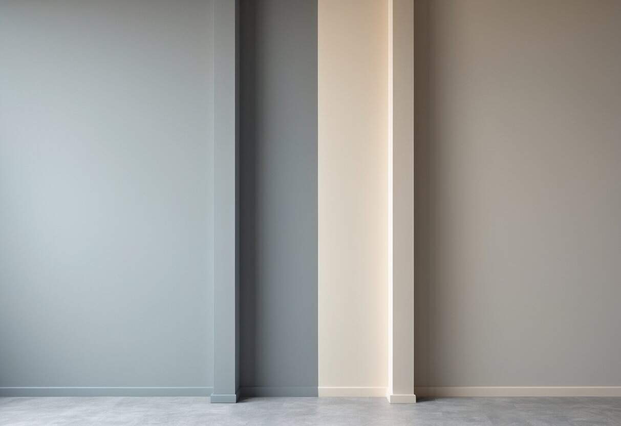
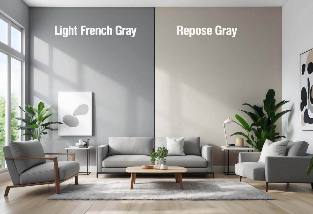
Choosing the right shade of gray can significantly influence the atmosphere and balance of a home’s interior. Among the most discussed options, Light French Gray and Repose Gray stand out for their distinct undertones and adaptability to different environments. Each color offers a unique character that can shift depending on lighting and surrounding materials.
Light French Gray leans toward a cooler, more refined appearance, while Repose Gray introduces a softer warmth that complements a wide range of décor styles. Understanding how each tone interacts with light and space helps homeowners make confident design decisions that align with their aesthetic goals.
Understanding Paint Color Basics
Key Color Terms
Paint experts often compare Sherwin-Williams shades to understand tone and brightness. The LRV (Light Reflectance Value) shows how much light a color reflects—higher numbers mean lighter colors.
| Paint Color | LRV | Color Type | RGB (R,G,B) | Hex Code |
|---|---|---|---|---|
| Aspect Light French Gray | 53 | Mid-tone gray paint color | 194,192,187 | #C2C0BB |
| Repose Gray | 58 | Light gray paint color | 204,201,192 | #CCC9C0 |
To deepen your understanding of how undertones affect the feel of a space, check out Westhighland White primer to see how light neutrals behave in different conditions.
Key Differences Between Light French Gray and Repose Gray
Light French Gray leans cool with blue and faint purple undertones, giving it a crisp, refined appearance. It often looks brighter and more modern, especially in spaces with cooler or indirect light.
Repose Gray, on the other hand, carries warm taupe undertones that soften its look and make it feel more inviting. It tends to appear balanced and adaptable under various lighting conditions.
| Feature | Light French Gray | Repose Gray |
|---|---|---|
| Undertone | Blue with subtle purple | Warm taupe |
| Temperature | Cool | Warm |
| Effect | Airy and modern | Soft and versatile |
Room-by-Room: Light French Gray vs. Repose Gray
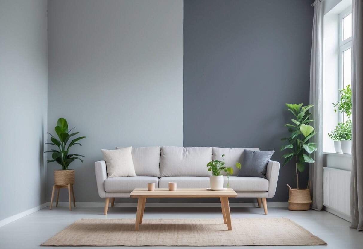
Living Areas and Connected Spaces
Sherwin Williams Light French Gray offers a crisp, cool presence that suits open layouts. Its faint blue-violet undertones give walls a modern edge and pair neatly with white trim or stainless accents.
Sherwin Williams Repose Gray leans warmer, bringing a balanced, welcoming tone that adjusts easily to shifting daylight. It supports both modern and traditional furniture styles without overpowering the space.
| Paint | Undertone | Best Pairings |
|---|---|---|
| Light French Gray | Cool, blue-violet | White trim, chrome accents |
| Repose Gray | Warm, greige | Wood tones, soft whites |
Sleeping and Resting Spaces
Light French Gray promotes a calm, refined atmosphere that works well with blue, lavender, or silver accessories. It helps bedrooms feel quiet and uncluttered. Repose Gray adds a soft warmth that enhances earth tones and woven textures, creating a stable and comfortable retreat.
Kitchen
Light French Gray gives kitchens a clean, modern appearance, pairing effectively with white cabinetry and marble or quartz countertops. Its cool tone offsets warm wood floors. Repose Gray adapts to mixed lighting, blending smoothly with stainless steel or brass fixtures and maintaining a cohesive look throughout the day.
If you want to view deeper or moodier gray options for comparison, see our Peppercorn color guide to contrast with lighter greys.
Bathrooms
Light French Gray produces a fresh, spa-like effect that brightens white fixtures and complements cool tiles. Repose Gray introduces gentle warmth, coordinating with stone surfaces, greige tile, and brushed nickel hardware while retaining consistent color even in low light.
Which Shade Feels More Enduring? Light French Gray vs Repose Gray
Both Light French Gray (SW 0055) and Repose Gray (SW 7015) maintain steady popularity among neutral paint choices. Each color appeals to different design goals, offering distinct undertones that influence their long-term relevance.
| Feature | Light French Gray | Repose Gray |
|---|---|---|
| Undertone | Cool, refined | Warm, balanced |
| Adaptability | Works best with deliberate coordination | Blends easily with varied styles |
| Common Use | Modern and traditional spaces | Transitional and contemporary interiors |
Repose Gray often fits evolving decor trends because of its subtle warmth and flexibility. Light French Gray, with its cooler tone, projects a more tailored look that endures in refined settings. Both remain reliable options for designers seeking neutral backdrops that resist short-lived trends.
Mistakes to Avoid
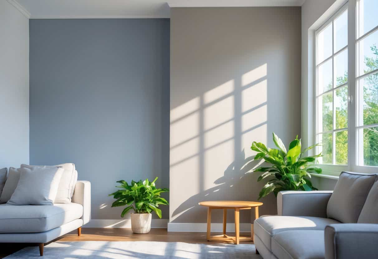
Avoid choosing paint colors only from photos or small swatches. Colors like Sherwin-Williams Pure White or Behr neutrals can look very different once applied to full walls. Always test samples on several surfaces and view them under changing light.
Pay attention to the lighting direction. North-facing rooms can make cool grays appear colder, while strong southern light may cause warm tones to fade.
| Lighting Condition | Common Issue | Suggested Action |
|---|---|---|
| North-facing | Colors appear dull or too cool | Use warmer undertones |
| South-facing | Bright light washes out color | Choose slightly deeper tones |
Observe how undertones shift during the day to ensure the chosen shade maintains the desired look.
Wrapping It Up
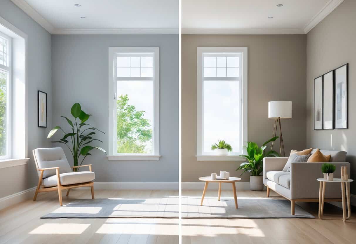
Selecting between Light French Gray and Repose Gray depends on how each shade interacts with the space and lighting. Each color responds differently to natural and artificial light, so observing them throughout the day provides useful insight. Testing larger paint samples helps identify subtle undertones that smaller swatches might hide.
When comparing both tones, it helps to note how they influence mood and furnishings. Light French Gray tends to bring a cooler, more refined appearance, while Repose Gray leans warmer and adapts easily to varied décor styles. A simple checklist can guide the decision:
| Consideration | Light French Gray | Repose Gray |
|---|---|---|
| Undertone | Cool, slightly blue | Warm, soft beige |
| Best for | Modern or minimalist rooms | Transitional or cozy interiors |
| Effect in low light | May appear cooler | Retains warmth and balance |
Practical Steps:
- Apply test patches on multiple walls.
- Observe them in morning, afternoon, and evening light.
- Compare how each interacts with furniture and flooring.
Both colors can transform a room’s character without overwhelming it. The choice often reflects personal preference and the desired atmosphere rather than strict design rules.