Sherwin-Williams offers a wide range of colors that bring both style and function to different spaces. One shade that stands out is Upward (SW 6239), a light blue with soft gray tones that feels calm and adaptable. Its subtle nature makes it easy to use in many settings without overwhelming the room.
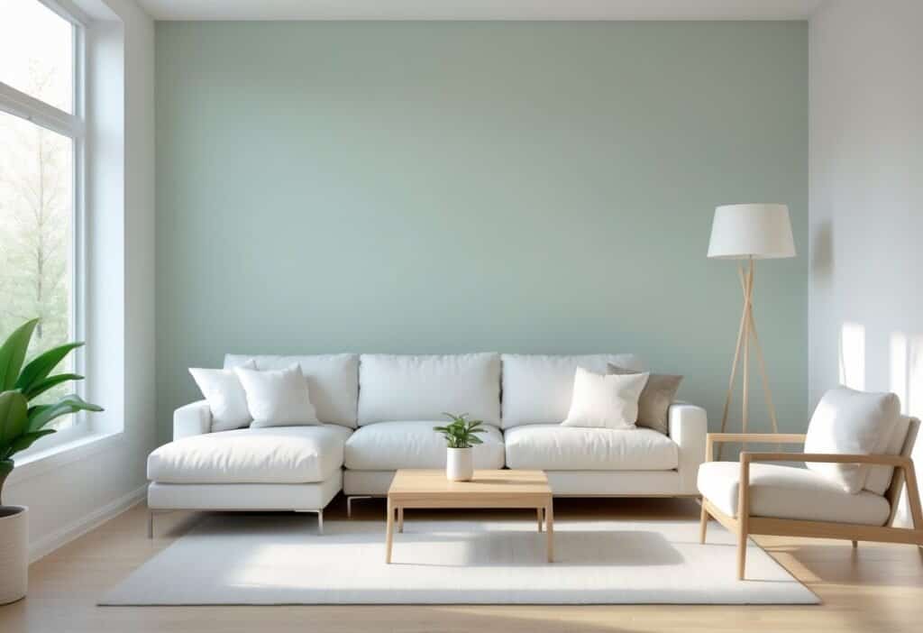
This color works well in bedrooms, living areas, and even exteriors, creating a relaxed atmosphere while blending with a variety of design choices. Its balance of coolness and softness gives it flexibility, making it a reliable option for homeowners and designers who want a fresh yet timeless look.
Key Takeaways
- Upward is a soft, versatile blue with gray undertones
- It works well in both interiors and exteriors
- It pairs easily with a range of coordinating colors
What Makes Sherwin Williams Upward Stand Out?
1. Gentle and Refined Blue Shades
Sherwin Williams Upward SW 6239 offers a soft blue that feels calm and approachable. Unlike brighter or more saturated blues, it carries a muted quality that makes it easy on the eyes. This subtlety helps it avoid looking overly playful or juvenile.
The color has a slight gray influence, which adds depth and maturity. This balance creates a shade that works in both casual and formal settings. Many find that it brings a sense of ease to a room, making it a reliable choice for spaces meant for relaxation.
| Feature | Effect in a Room |
|---|---|
| Light blue base | Creates a calm backdrop |
| Gray undertone | Prevents the color from looking too bright |
| Soft finish | Adds comfort and approachability |
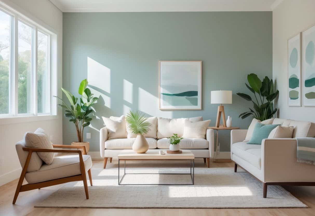
2. Flexible Use Across Styles
Upward adapts well to different design approaches. In coastal interiors, it pairs naturally with white trim, sandy neutrals, and weathered wood, giving off a breezy and relaxed look. In more modern or farmhouse-inspired spaces, it supports bolder accents like black fixtures or rustic beams without clashing.
This adaptability makes it a practical choice for homeowners and designers. It can serve as a main wall color, but it also works well in smaller doses, such as on cabinetry, furniture, or accent walls. Its ability to shift between design styles means it does not feel limited to one type of home.
Examples of where Upward SW 6239 works well:
- Coastal living rooms with light wood and woven textures
- Farmhouse kitchens with black hardware and natural beams
- Minimalist lofts with metal finishes and concrete flooring
3. Mix of Warm and Cool Undertones
One defining feature of Upward is how it responds to different lighting. In the morning, natural sunlight can bring out a slightly warmer, periwinkle-like quality. By midday, it settles into a balanced blue that feels fresh and even. In the evening, it deepens slightly, creating a more intimate atmosphere.
This shifting quality allows it to act as a bridge between warm and cool design elements. It pairs seamlessly with wood tones, marble, and metal finishes, making it easy to coordinate with existing materials. Because it does not lean too far in either direction, it remains versatile throughout the day.
Key qualities of Upward SW 6239:
- Adjusts with natural light
- Works with both warm and cool finishes
- Maintains a steady, balanced appearance
At 403 words, this section highlights why Upward SW 6239 is valued for its subtle color, adaptability, and balanced undertones.
Where Can You Use Sherwin Williams Upward?
1. Ideal for Bedrooms and Bathrooms
This shade works well in personal spaces where comfort matters most. In bedrooms, it creates a calm and airy setting that feels restful at any time of day. Bathrooms benefit from its soft tone, especially when paired with white tile, chrome, or brushed nickel finishes.
A simple pairing example:
| Element | Works Well With Upward |
|---|---|
| Flooring | Light wood or white tile |
| Fixtures | Chrome, nickel, or matte black |
| Accents | White linens, pale gray towels |
Its gentle quality makes morning light feel softer and evenings more relaxed.
2. Suitable for Living Spaces and Shared Rooms
Upward adapts well to larger areas where people gather. In open layouts, it gives walls a balanced look that feels both welcoming and spacious. The color blends smoothly between connected rooms, avoiding sharp contrasts.
It also acts as a neutral backdrop for artwork, bookshelves, and furniture. This makes it useful for those who want their decor to stand out without the wall color competing for attention.
Consider these pairings:
- Artwork frames: black, oak, or white
- Furniture fabrics: beige, navy, or soft gray
- Lighting: warm white bulbs to soften the tone
3. Great Choice for Exteriors and Entryways
On the outside of a home, this color provides a balance of subtlety and character. It complements white trim, gray siding, or natural stone while still offering distinction. A front door painted in this shade can add a welcoming touch without appearing too bold.
The tone shifts with daylight, appearing lighter in the morning and deeper in the evening. This gives exterior surfaces quite a variation throughout the day. Many homeowners value this flexibility because it keeps the look fresh without frequent repainting.
| Exterior Element | Works With Upward |
|---|---|
| Trim | White or cream |
| Siding | Gray, taupe, or stone |
| Door Hardware | Black or brass |
Coordinating Colors with Sherwin Williams Upward
1. Pairing with Subtle Neutrals
Upward works especially well with soft neutrals that balance its airy tone. Pure White (SW 7005) creates a crisp contrast, giving spaces a clean and polished look. This pairing highlights Upward’s light quality while keeping the room bright.
Another option is Agreeable Gray (SW 7029). This shade adds a grounded layer without making the palette feel heavy. The mix of gray and blue keeps the atmosphere calm while adding warmth.
| Neutral Shade | Effect with Upward |
|---|---|
| Pure White | Fresh, bright, clean contrast |
| Agreeable Gray | Soft grounding, adds warmth |
2. Adding Strong Contrast
For those who want more impact, darker shades bring striking contrast to Upward. Naval (SW 6244) introduces depth and richness, especially on built-ins or accent furniture. The combination feels natural yet bold, similar to the meeting of sky and sea.
Tricorn Black (SW 6258) provides a sleek, modern edge. It works well on trim, window frames, or hardware, where small details stand out against Upward walls. The sharp lines of black against soft blue-gray create a balanced and contemporary style.
- Use Naval for cabinets or shelving.
- Apply Tricorn Black on fixtures or framing.
- Let Upward cover main walls for contrast.
3. Blending with Gentle Tones
Soft colors close in tone to Upward create a smooth, calming flow. Sea Salt (SW 6204) introduces a light coastal feel with a hint of green. Rainwashed (SW 6211) adds a more noticeable green undertone, keeping the palette fresh and organic.
Using these shades together with Upward allows each room to connect while still offering variation. The result feels cohesive without being repetitive.
| Soft Shade | Mood Created |
|---|---|
| Sea Salt | Coastal, airy, relaxed |
| Rainwashed | Fresh, natural, organic |
Comparisons with Related Shades
1. What Makes Upward Different from Other Blues
Upward stands apart from many familiar blues because it balances clarity with softness. While Misty (SW 6232) often feels closer to a gray tone with only a light touch of blue, Upward shows a stronger blue presence without losing refinement.
Placed side by side, Upward looks more lively yet still controlled, offering a fresher quality in comparison. Benjamin Moore’s Horizon (OC-53) leans cooler and more muted, which can feel more formal. By contrast, Upward adds warmth that can make a room feel more open and welcoming.
A quick comparison can help highlight the differences:
| Color Name | Tone Description | Effect in a Room |
|---|---|---|
| Upward (SW 6239) | Balanced blue with subtle warmth | Inviting, adaptable |
| Misty (SW 6232) | Gray with a light blue tint | Calm, understated |
| Horizon (OC-53) | Cooler gray-blue | Reserved, formal |
This balance of undertones makes Upward useful in many settings where other blues might feel either too flat or too cold.
2. Picking the Best Blue for Your Room
Lighting plays the most important role when choosing between these shades. In north-facing rooms, Upward’s warmer undertones show more clearly, while south-facing spaces make its cooler side visible. This shifting quality allows it to adapt throughout the day.
For rooms with little daylight, testing samples on the wall is helpful. Observing the color in morning, afternoon, and evening light shows how much it changes.
Room function also matters:
- Relaxing spaces (bedrooms, reading areas) often benefit from Upward’s calm yet lively tone.
- Formal spaces (dining rooms, offices) may suit Horizon better because of its cooler and more restrained look.
- Balanced spaces (living rooms, multipurpose areas) often work well with Upward since it bridges gray and blue effectively.
Because of its mix of warm and cool undertones, Upward can look soft and airy in daylight but richer and more grounded in lower light. This flexibility makes it a practical choice for those who want one color to serve multiple moods in a single space.
Closing Thoughts
The shade Upward (SW 6239) by Sherwin Williams presents a calm mix of blue and gray that works well in many settings. Its gentle tone makes it suitable for both small and large spaces, offering a look that feels steady without being dull. Many find it appealing because it blends easily with different design styles.
This color pairs well with a wide range of options:
- Neutrals for a clean and simple style
- Bold accents to create contrast
- Natural textures like wood or stone for warmth
Such flexibility allows it to serve as either a main wall color or a supporting backdrop. It can brighten living areas, add softness to bedrooms, or bring a fresh look to exterior walls.
The balanced nature of this shade shows why it remains a reliable choice for homeowners and designers. Its adaptability makes it a practical option for creating spaces that feel both stylish and comfortable.
Frequently Asked Questions
Is This Shade Too Blue for Use Across an Entire Home?
This color works well as a whole-house option because it feels soft and balanced. It has enough depth to add interest, but does not overwhelm when used in many rooms. Different lighting in each space can make it look slightly varied, which helps avoid a flat or repetitive look.
Tip:
- Use it in both open layouts and private rooms to create a consistent flow.
- Pair with neutral trim for a clean, unified style.
Will This Color Make a Small Room Appear Darker?
In smaller spaces, this shade reflects enough light to keep the room from feeling heavy. With the right lighting, it can even make a compact area look more open. Natural daylight works best, but well-placed lamps or ceiling lights also help.
Lighting Suggestions:
- Natural light: Keeps the tone fresh and airy.
- Warm bulbs: Adds coziness without losing brightness.
- Cool bulbs: Maintains a crisp and modern feel.
Does This Shade Match Well with Warm Wood Finishes?
This color blends smoothly with warm woods like oak, walnut, or maple. Its gray base helps balance the cooler undertone of the paint with the warmth of the wood. The result is a look that feels natural and grounded.
Examples of Pairings:
| Wood Type | Effect with Color |
|---|---|
| Light Oak | Soft and relaxed |
| Dark Walnut | Rich and striking |
| Maple | Warm yet balanced |
Can This Color Be Used on Exterior Surfaces?
It performs well outdoors and gives homes a polished, modern look. When used on siding, it adds curb appeal without feeling too bold. Direct sunlight may make it appear lighter, so testing a small swatch outside is a smart step.
Exterior Uses:
- Works nicely with white trim for contrast.
- Complements stone or brick details.
- Suitable for both contemporary and traditional homes.
How Does This Shade Compare with Other Gray-Blue Options?
Compared to other gray-blue paints, this one leans slightly warmer, which makes it more versatile. It avoids looking too cold while still keeping a modern edge. Many designers highlight it as a balanced choice in color marketing, especially since it was recognized as a color of the year.
Comparison Table:
| Color Name | Tone | Key Difference |
|---|---|---|
| Misty | Cooler | Feels more crisp |
| Horizon | Neutral | Slightly lighter |
| Upward | Warm gray-blue | Balanced and adaptable |