
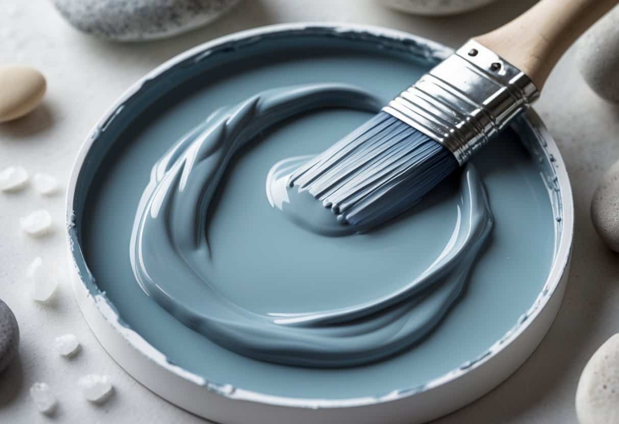
Sea Salt by Sherwin-Williams is a soft mix of green and blue that gives rooms a calm and balanced look. Many homeowners choose it for its gentle tone that changes slightly with the light, making spaces feel open and relaxed. Its versatility allows it to fit well in coastal, modern, and traditional styles alike.
This color reacts to lighting in unique ways, appearing cooler or warmer depending on the time of day. Designers often use it to create a peaceful atmosphere without overwhelming a room. Understanding how it behaves in different settings helps homeowners decide if it suits their space.
This shifting quality is similar to how Peppercorn Sherwin Williams changes tone throughout the day, showing how light can completely transform a color’s feel.
The Deep Undertones that Make Sea Salt Stand Out
Sea Salt carries a balanced mix of green, gray, and blue that changes with the light. This subtle blend gives it a soft, adaptable look that fits many spaces. The color never feels flat because each tone plays a part in how the room feels throughout the day.
In bright daylight, the green tones appear stronger. They bring a clean, natural energy that works well in kitchens, work areas, or bathrooms. As the light fades, the color shifts. The blue and gray undertones become more visible, adding a calm and restful quality that suits bedrooms or living spaces.
If you enjoy exploring complex neutrals, you might also like Sherwin Williams Upward, which offers a softer blue tone with a similarly calm mood.
| Attribute | Detail | Description |
|---|---|---|
| Paint Name | Sea Salt | Signature shade from Sherwin-Williams |
| Color Code | SW 6204 | Official catalog number |
| LRV (Light Reflectance Value) | 63 | Reflects a moderate amount of light |
| RGB Values | 205 / 210 / 202 | Digital representation for screens |
| Hex Code | #CDD2CA | Web color match |
This color’s strength lies in its ability to adapt. On one wall, it might lean green; on another, it might look more blue. The shift depends on the type and direction of light. This makes each room feel slightly different without changing the paint itself.
Sea Salt’s mid-level reflectance helps it stay bright without glare. It supports both natural and artificial light, keeping spaces open and balanced. Many people choose it because it feels peaceful but not dull. It blends easily with neutral décor, wood tones, or soft textiles.
Its understated nature allows furniture and accents to stand out while still tying the room together. The quiet mix of hues gives depth and softness, creating a setting that feels steady and relaxed from morning to night.
How Does Sea Salt Influence the Atmosphere of a Room?

Sea Salt gives a room a calm and balanced atmosphere. Its soft mix of green and blue tones helps spaces feel open and easy to breathe in. Even small rooms appear larger because the color seems to push the walls outward, adding a sense of space and light.
During the day, the color shifts with natural light.
- Morning: The green tones appear stronger, making the room feel clean and fresh.
- Afternoon to Evening: The blue tones become more noticeable, creating a quiet and relaxed mood.
This gentle change keeps the space from feeling static. It supports a natural rhythm that matches how light moves through the day.
| Time of Day | Dominant Tone | Mood Created |
|---|---|---|
| Morning | Greenish tint | Fresh, airy feel |
| Evening | Bluish tint | Calm, restful vibe |
Sea Salt also cools a room visually without making it feel cold. It works well in living areas, bedrooms, and bathrooms where comfort matters. Many people find that this color encourages slower movement and softer conversation. Its subtle nature helps the mind rest, giving the room a peaceful and welcoming presence.
What Makes Sea Salt a Great Choice for Any Space?

Sea Salt adds quiet character to many rooms without drawing too much attention. It fits naturally in kitchens, living rooms, bedrooms, and offices, giving each space a soft and balanced look. The color holds interest but stays gentle, which makes it easy to live with every day.
Its flexibility makes it work with many design styles:
| Style Type | How Sea Salt Complements It |
|---|---|
| Coastal | Reflects the calm tones of ocean views and sandy beaches. |
| Farmhouse | Enhances wood details and vintage accents with a clean backdrop. |
| Modern | Softens sharp lines and adds subtle warmth to sleek surfaces. |
Sea Salt changes slightly with natural light, offering a sense of movement that plain neutrals often lack. This shifting tone keeps walls from feeling flat or dull.
In bedrooms, it helps create a calm and restful setting. In family spaces, it supports daily activity without competing for attention.
Key benefits:
- Versatile enough for many rooms and styles
- Soft depth that prevents a sterile look
- Timeless appeal that stays fresh over time
Its gentle color balance gives spaces a relaxed, welcoming feel that lasts.
How Sea Salt Works with Specific Décor Elements

Sea Salt pairs well with many furniture tones. White pieces appear crisp and layered, while dark woods look rich without feeling heavy. Navy upholstery gives a calm coastal look, and leather in brown or black balances the paint’s cool undertones.
For windows, white curtains keep the space airy. Linen panels in cream or gray bring a soft, casual feel. Navy or charcoal drapes add contrast that suits dining areas or workspaces.
Artwork and wall décor stand out against this shade. Black-and-white photos look sharp, and colorful art gains subtle depth. Wood frames feel natural, while brass or gold finishes offer gentle warmth. Metal shelves in white or dark tones both blend smoothly.
Lighting changes how Sea Salt appears. Warm LED bulbs (2700K–3000K) highlight green notes. Brass or copper fixtures add comfort to kitchens, and light lampshades keep the wall color true.
| Accent Type | Works Well With Sea Salt |
|---|---|
| Warm Accents | Coral pink, soft yellow |
| Cool Accents | Navy, charcoal |
| Natural Elements | Wicker, plants |
| Metals | Brushed nickel, chrome, brass, black iron |
Top Spots to Use Sea Salt Around Your Home
1. Bathroom Spaces
Sea Salt adds a calm, clean look to any bathroom. Its soft blue-green tone helps small spaces feel open and bright. Pairing it with white trim and light wood accents keeps the room simple and timeless.
Quick Tips:
- Use matte paint for walls to reduce glare.
- Add natural baskets or towels in beige for balance.
- Combine with brushed nickel fixtures for a modern touch.
| Feature | Benefit |
|---|---|
| Light reflection | Makes small rooms feel bigger |
| Neutral tone | Matches tile and wood finishes |
| Cool undertone | Keeps the space fresh |
2. Restful Bedrooms
This shade works well in bedrooms where relaxation matters. Its gentle color shifts between green and blue depending on the light, giving the room a soft and natural look. It pairs nicely with white bedding, linen curtains, and light oak furniture.
Lighting Tip:
- Morning light brings out the green tones.
- Evening light makes the color appear more blue.
A simple color scheme with Sea Salt keeps the space calm without feeling plain.
3. Kitchen Storage and Cabinets
Sea Salt can bring quiet color to kitchen cabinets. It offers a subtle alternative to plain white or gray. When used on lower cabinets with white uppers, it adds depth without overpowering the room.
Design Ideas:
- Match with white countertops for a clean look.
- Use matte black handles for contrast.
- Add open shelving in natural wood to warm the space.
This approach keeps the kitchen bright yet balanced.
4. Shared Living Areas
In living rooms or family spaces, Sea Salt provides a soft backdrop for furniture and artwork. Its neutral tone blends well with many materials, from leather sofas to woven rugs.
Pairing Suggestions:
- Works with both warm and cool wood tones.
- Complements gray, tan, and cream fabrics.
- Keeps open areas looking airy and relaxed.
The color supports a welcoming setting without drawing too much attention.
Flooring Styles that Work Best with Sherwin-Williams’ Sea Salt
1. Pale Natural Wood Floors
Light-colored hardwoods such as oak or maple pair nicely with Sea Salt’s soft blue-green tone. Their warm undertones balance the paint’s cooler shade, creating a calm and open space. This mix helps a room feel bright without losing a sense of comfort.
Homeowners who prefer a warmer neutral backdrop can check out Swiss Coffee Sherwin Williams, a timeless shade that complements natural wood tones beautifully.
Quick Tips:
- Choose satin or matte finishes for a relaxed look.
- Keep wood grains visible to add texture and depth.
| Wood Type | Finish | Effect |
|---|---|---|
| Oak | Satin | Warm and balanced |
| Maple | Matte | Clean and airy |
2. Faded or Whitewashed Wood Finishes
Whitewashed and bleached floors enhance Sea Salt’s coastal quality. These light surfaces reflect natural light, letting the wall color shift gently between blue and green tones. This pairing works well in rooms that get a lot of daylight, such as sunrooms or entryways.
Design Note: Use minimal rugs so the flooring can reflect more light and keep the space feeling open.
3. Soft Neutral Carpet Options
Carpets in beige, greige, or pale gray tones blend smoothly with Sea Salt walls. These subtle shades prevent the room from feeling dated while maintaining a soft, inviting look. Both plush and low-pile styles fit this palette, depending on how formal or casual the space is.
Recommended Carpet Shades:
- Warm beige for a cozy setting
- Greige for a balance between warm and cool tones
- Light gray for a modern, understated look
4. Cool Gray Tile Surfaces
Gray tile floors, especially in light or medium tones, highlight Sea Salt’s muted gray hints. This combination suits bathrooms, kitchens, and laundry areas where durability and easy cleaning matter. The cool tones coordinate well without making the space feel stark.
Tip: Choose tiles with a matte or stone-like texture to keep the look natural.
5. Flooring Choices to Skip
Very dark woods like walnut or cherry can overpower Sea Salt’s softness. The deep contrast may make walls appear dull or washed out. Floors with strong red or orange tones often clash with the paint’s cool base, creating an uneven color balance.
Avoid:
- Dark reddish hardwoods
- High-gloss finishes that exaggerate contrast
- Warm-toned stains with orange or red hues
Sea Salt Compared to Other Sherwin-Williams Shades
Sea Salt (SW 6204) blends blue, green, and gray tones, giving it a calm and balanced look. Its ability to shift with light makes it a reliable choice for most rooms, especially bathrooms and bedrooms.
| Color | Main Difference | Best Use | Impression |
|---|---|---|---|
| Sea Salt (SW 6204) | Balanced mix of blue, green, and gray | Versatile spaces | Soft and adaptable |
| Rainwashed (SW 6211) | Leans more blue | Rooms needing a clearer blue tone | Feels brighter and less neutral |
| Comfort Gray (SW 6205) | Stronger green with extra gray | Earthy, relaxed rooms | Reminds of muted sage |
| Silver Strand (SW 7057) | More gray, less color | Modern, subtle interiors | Feels clean and understated |
Testing samples in different lighting helps reveal how each shade changes throughout the day.
Conclusion
Sea Salt continues to earn attention for its balanced mix of blue, green, and gray tones. This blend gives rooms a calm and adaptable look that fits many interior styles. Its soft appearance allows it to pair well with both light and dark furnishings.
Testing the color in natural and artificial light helps reveal its subtle changes. A small sample on the wall can show how the shade reacts throughout the day. This simple step helps homeowners choose confidently before painting an entire space.
Tips for Trying Sea Salt:
- Paint a small section in different rooms.
- Observe the color under daylight and evening light.
- Compare it with nearby furniture and flooring.
- Note any shifts in tone as the lighting changes.
| Lighting Type | Color Appearance | Suggested Use |
|---|---|---|
| Bright daylight | Cool and airy | Living rooms, kitchens |
| Soft evening light | Warm and muted | Bedrooms, bathrooms |
| Artificial light | Neutral balance | Hallways, offices |
Sea Salt’s flexibility makes it a dependable choice for those seeking a fresh update without strong contrast. It works well as a main wall color or as a supporting tone beside bolder accents. The effect often feels clean, relaxed, and welcoming.
Designer Alex Guerrero, with over 15 years in color and design, continues to highlight how shades like Sea Salt can shape mood and space. His experience in both fine arts and interior design supports his practical approach to using color in everyday environments.